Project Setup
Appearance
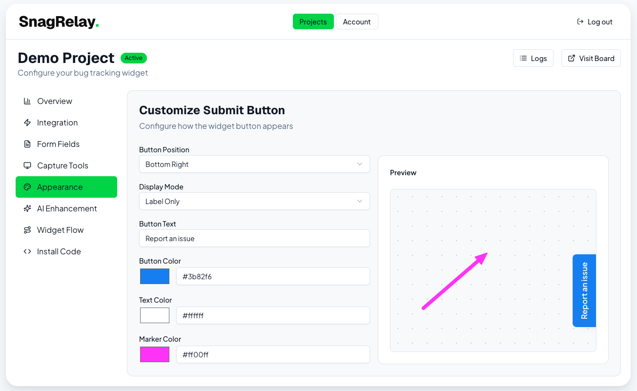
Customize the widget button's position, size, color, and label.
The Appearance tab (labeled "Customize Submit Button" in the dashboard) controls how the widget button looks on your site, with a live preview as you edit.
Options
| Setting | Values |
|---|---|
| Button position | Bottom Right · Bottom Left · Top Right · Top Left |
| Display mode | Label Only · Icon + Label · Icon Only |
| Button icon | Choose an icon (shown unless Label Only is selected) |
| Button text | Custom label, e.g. "Report Bug" (default: "Report an issue") |
| Button color | Background color |
| Text color | Label/icon color |
| Marker color | Color used for the default annotation marker |
Defaults
Out of the box, the button uses a blue primary color with a magenta marker, positioned bottom-right, with the label "Report an issue". These are meant to be replaced — most teams set the button color to match their own brand.
Intro bubble
Some projects also support a small bubble — an intro message shown near the button before it's clicked, with its own position, text, delay, and "show once per user" option. Use it sparingly; it's most useful right after installing the widget on a new site to nudge early testers to try it.
Screenshot